
There are two main kinds of type that fall under the “script” category: calligraphic script, and handwriting script. While calligraphic typefaces tend to be cursive and elegant, handwriting typefaces appear as printed script, and are usually portrayed as more childlike. Balloon is a handwriting script typeface created by Max Kauffman in 1939 for American Type Founders, an agglomeration, which explained by Monotype, dominated the printing and type industry in the 1920s and 30s. Balloon was intended as a title font and was created with only uppercase characters. Kaufmann created it to be paired with his lowercase cursive-style Kaufmann Script.
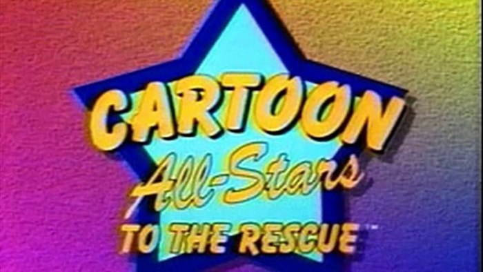
It’s likely you have seen Balloon used generically in all sorts of places. It’s easily recognizable as a go-to cartoony font for children’s products or other playful placements. Probably the most high-profile use of the font was by children’s television network Nickelodeon. Another notable use was for the credits of films in the Madeline franchise, which followed a similar typeface used on the covers of Ludwig Bemelmans’ original picture books.

Although its usage is not nearly as common as sans and serif type, it is easy to see why certain brands or entities looking to present a certain kind of message have chosen to use handwriting style fonts like the Balloon family typefaces. Its very structure, with thick strokes and open ends imply the deftness of print handwriting.
Nickelodeon has changed their logo several times since the network’s inception in 1979, but its longest used logo is the orange “splat” with “Nickelodeon” portrayed in white balloon font. The Balloon lettering was used from 1984 to 2009, when it was traded for a more modern custom font. According to Sarah Banet-Weiser, when Nickelodeon rebranded in the 80s, they chose the splat logo to portray childlike playfulness and creativity, with the splat being flexible and changing shape. This was part of the channel’s new prerogative to be a brand that “empowered kids” and supported creativity and imagination. While the orange logo could assume the shape of a turkey for thanksgiving or a bat for Halloween, the lettering always remained consistent, and echoed the childlike qualities of the orange splat.
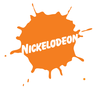
Research by Pamela Henderson states that while handwritten style fonts can be “unsettling” (think comic sans) and not as “reassuring” as more harmonious, subtle fonts, they are also found to be more engaging and emotionally exciting, and elicit an “edginess”, that some companies like Nickelodeon may desire.
