When scrolling through a book of fonts or even just Microsoft Word, script fonts are almost impossible to miss. Any font that looks like they do not belong within the classic body fonts is most likely to be a script font. As stated by Jacci Howard Bear of Lifewire, script fonts are any fonts that mimic “historical or modern handwriting” styles. They are usually characterized by connecting and flowing typefaces and slanted, rounded letters. There are a few fonts that dominate the script font category, one of which being the font we are discussing today: brush script typeface.
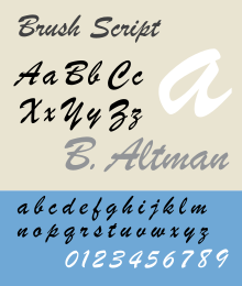
As referenced by Revolvy, brush script was designed by Robert Smith in 1942. He originally designed it for the American Type Founders or ATF, but it found immediate success with advertisers and retailers. It is characterized by its graphic strokes and handwritten inked letters. It is also known for its deliberately irregular lowercase letters as stated by Revolvy. The font saw the most success during the 1950s and 60s, as it was associated with nostalgia for the WWII era. Overall, brush script is one of the most well known handwritten fonts. As referenced by Jacci Howard Bear of Lifewire, script fonts are most often used when they are paired with a non-script font to create balance. They are also used almost exclusively in lowercase, as script fonts can become unreadable when they are in all uppercase.
The literature on whether fonts in advertising, especially script fonts, really make a difference is extremely polarized. In some academic journals, scholars find that typography actually makes a huge difference in advertising. For example, Jennifer Amar recognized that visual elements of advertising, like font, actually have persuasive effects on them. The other side, however, presents the argument that there is not enough research to fully understand whether typography really affects consumer persuasion. This comes into play a lot when it comes to script fonts, as they are often used as an accent font. A lot of the times, the argument for script fonts is that they are persuasive, which is why this is an important argument when it comes to this group of typefaces.

Other than their “persuasive” qualities, script fonts are also known for their more feminine features. As recognized by Bianca Grohmann, script fonts are most well known for attracting people with more feminine features and AIOs. For that reason, most ads that are targeting females use script fonts. An exception to this usual rule, however, is the Late Show with David Letterman’s use of brush script as stated by Revolvy. David Letterman used it for the “Ed Sullivan Theater” text in his logo. This is an exception, but it could also be used as a persuasion method to get more female viewers. This could also be said for the Jerry Springer Show, which also used brush script in their logo.
